TGJ 2O0 – Desktop Publishing – Menu Design
Overall Expectations
A1.2 demonstrate an understanding of design elements (e.g., line, form, colour, texture, space) and principles (e.g., balance, rhythm, proportion, contrast, flow);
A1.5 identify different types of communications software used to create communications technology products and services (e.g., software for photo, audio, and video editing, animation, page layout, web page creation, and computer graphics) and describe how they are used.
B3.1 apply creative skills, equipment operating skills, and software skills to create components for a media production (e.g., text, video footage, voice-overs, graphics, animations for a video promoting a school event);
Enduring (Key) Learning
This assignment should provide the beginning of a full understanding of the elements of graphic design, particularly page layout and design. The four principals of C.R.A.P will be the main takeaway from this lesson.
Prior Learning
Most students will have produced documents using a variety of desktop publishing software but most have not considered elements of design in doing so. Their prior knowledge in desktop publishing will help them along the road to quality document design.
Getting Ready
This lesson will build on the introductory lessons you have presented in desktop publishing (in my case this is InDesign). Students should have a good handle on the mechanics of page layout in whatever software you are using.
Teaching Strategies/Lesson Content
If you had your own restaurant, what would be on the menu? Would it be a fancy fine dining affair or a fun, kid-friendly burger joint? What would your restaurant be called? You can come up with a completely original idea or modify something that already exists.
Design a menu for a restaurant that includes at least 10 items with descriptions and prices. Include pictures for some but not necessarily all – that’s your choice.
Need some inspiration? Here is a Google image search for restaurant menu. Most of these are pretty plain – I’d like you to spice yours up with appropriate images and graphics.
Remember your design principles:
Contrast: How will you make your items stand out? Will the name of the restaurant stand out from the rest of the page?
Repetition: Choose one or two fonts to use throughout the menu. Use bold or italic if you need to make something stand out. Select colours that you can use throughout your design.
Alignment: How will you organize your menu items? Will you place them neatly in columns? Where will the images go?
Proximity: How will you group similar items (desserts, main dishes, etc)?
Your font selection is key here. This is the easiest way to give your reader an idea of what sort of experience they will have in your restaurant.
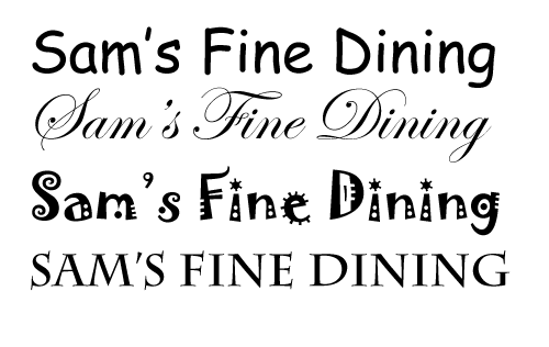
Check out the following graphic for an example of how a font change can completely change the feel of text:

The top text (which is Comic Sans, and should never be used, ever!) is very informal and relaxed. The second is a script type font which is much more refined and formal. The last two are along the lines of the first, but are a little more serious. This is something that you will have to experiment with in order to develop your own style. Always make sure that the fonts you are choosing are readable though!
